Firstly I chose an Image from my last assignment. I then transferred it into Photoshop, ready to be adjusted.
RESOLUTION
The first thing I needed to do was adjust the DPI (Dots Per Inch). In its original state the image was of an extremely large size, but low resolution. (72 resolution). To change this I selected 'Image', the 'Image Size' and changed the resolution to 300. I also selected 'Re sample Image' and then 'Change'. This appears to have no effect on the appearance of the image, BUT will make it a lot more appropriate for publication.


I also repeated these steps for the found images that I will be using in my final magazine double page spread. Originally these images typically were being displayed at under 100 DPI and therefore would not have been appropriate for my target audience.
UNSHARP MASK
 After this, I used another common technique to make the image appropriate for print. To do this I selected 'filter', 'sharpen', then 'Unsharp mask'. I was then presented with this window (left).
 I then changed the 'Amount to 140% and the pixels to 2.2. This makes the image sharper and more appropriate for Publication.
This is a typical step that will be used by the vast majority of major magazine companies.
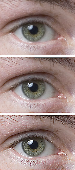
The effects of this are subtle but are most notable when looking at the subjects eyes.
CLONE STAMP TOOL
The clone stamp tool is used to remove spots and blemishes. In this case I used the tool to improve the appearance of the subjects cheek for print.

I achieved this by pressing the 'ALT' key next to the imperfection and then painting over the spot with the new texture
BURN AND DODGE (LIGHTING TOOLS)
Burn and dodge tools are used to both lighten and darken images. In the case of this image I used the Burn tool to make Chloe s character appear darker and more dangerous.

After evaluation however, although I had learned how to use the effect. I felt the it had been over used in the example above. I therefore decided to decrease the severity of the effect and make it less extreme. This is evident in the images that follow this section.
CURVES
Curves are used as a way of changing the overall style and finish of the image.
To use this effect firstly I selected adjustments and then curves.

My Final Front Cover
I have now started my final image and front cover design. Below is a list of the steps I have taken to create the most effective product possible.
1- Firstly I needed to download the appropriate font. Total Film use Eagle Bold for the front cover title.

After downloading the font I was able to install it and then add it to my front cover

In Design Experimentation

This lesson I learned how to use in design at a very basic level. The black arrow is used tool is used to move the image and the frame of the pictures so that the design of the page looks good. The red arrow focuses on scaling the images . When using the white arrow tool the shift button must be pressed so that the image is not stretched. In addition to this, I have also learned various skills with using text. You can vary the size of text much as you would on Microsoft Word with the drop down options at the top. Text is inserted using the text key and and create a space. The Black and White arrow can also be used in these incidents to resize and frame the text in the same way that they do for images. Images can also be added to InDesign sheets by saving them from a webpage and then adding them to the document. The space for the image is created by using the rectangle icon and adding it to the page. It is important to make sure the image is large and of a high quality when it is saved in order to produce high quality work.
Lesson 2

During this lesson I learned how to change the presentation of my titles by changing fonts or editing the colour options. In the example above I have removed the fill options and increased the thickness in the outside of the text. I also learned how to add effects to the text like drop shadows, but chose not to use it on this occasion as I feel the article looks better without it. I have also learned how to add text from my pre-written article (word document) and insert it onto my page as a text flow. To do so I saved my article into a file and then added it to my In Design work into pre made article places. This makes the page look professional. This also uses 'Text Flow' which helps keep articles organised and within the parameters that I set before I transferred the content.

No comments:
Post a Comment